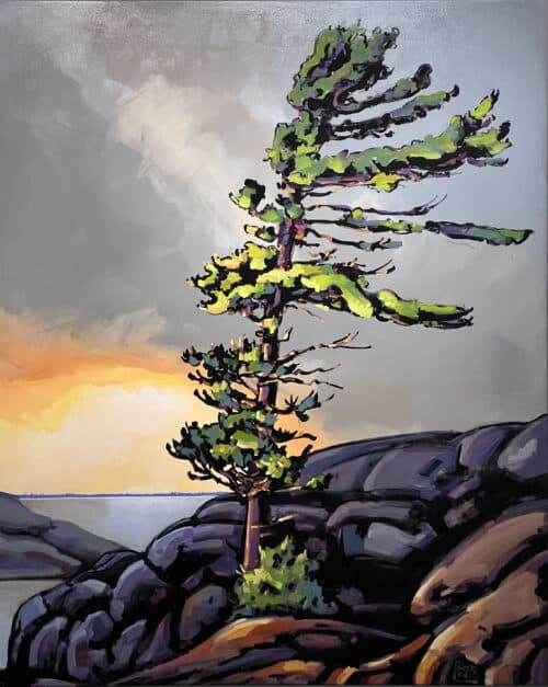
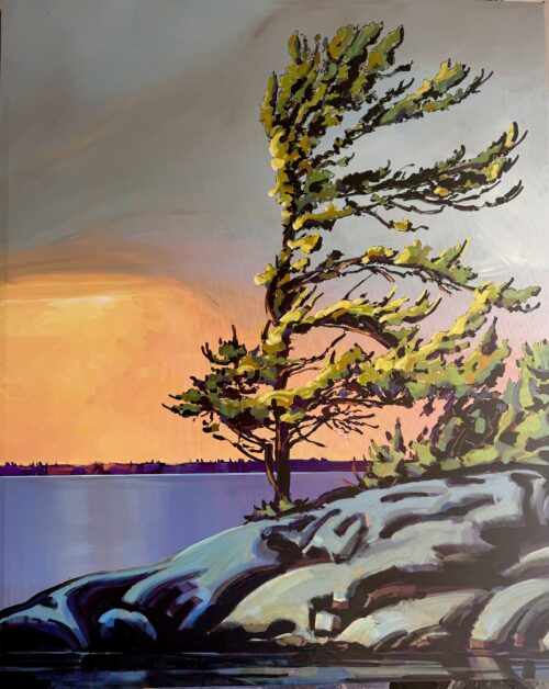
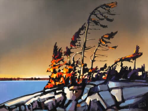
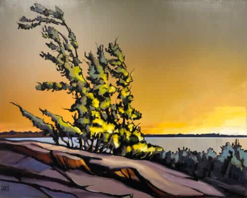
Jerzy Werbel’s “Wild is the Wind” painting features a stunning display of complementary colours, including storm gray, sundance, and turtle green. The artist utilized these colors to create a dynamic and harmonious composition. Storm gray, a cool, muted shade of gray, forms the foundation of the painting’s background, creating a calming, soothing effect. Against this backdrop, the warmer, more vibrant shades of sundance and turtle green pop, creating a sense of energy and movement. Sundance, a bold shade of yellow-orange, is used to highlight certain areas of the painting, such as the sun’s reflection and the needles on the evergreen tree. This colour adds warmth and intensity to the painting, creating a sense of liveliness and spontaneity. Turtle green, a rich, earthy shade of green, is used in highlighted greenery to create balance and harmony. This colour adds depth and dimension to the piece, helping to ground the other, more vibrant colors and creating a sense of stability. Overall, the use of storm gray, sundance, and turtle green in “Wild is the Wind” showcases the artist’s masterful use of colour to create a visually stunning and emotionally compelling piece of art.
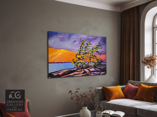
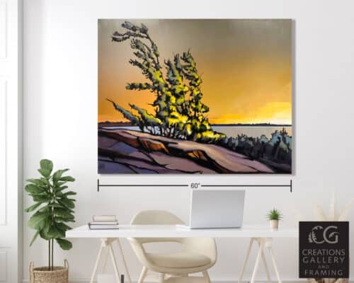
Jerzy Werbel Wild Is The Wind 48×60
This painting by Jerzy Werbel is SOLD. However, you can still check out our IN-STOCK alternatives by clicking here. To view, the artist’s full collection of artwork see the gallery portfolio page at Jerzy Werbel Artist Page
For a commission similar to this painting don’t hesitate to get in touch with the gallery, you are welcome to use this button:
Description
Additional information
| Shipping Weight | 78 lbs |
|---|---|
| Shipping Dimensions | 6 × 66 × 54 in |
| Mediums | |
| Art Category | |
| Artist Name | |
| Style | |
| Subject |