Seeing Art in the Best Light: A Homeowner’s Guide to Gallery-Quality Lighting
Illuminating Artwork: An Art Curator's and Homeowner's Guide to Gallery-Quality Lighting and Glare Prevention
1. The Strategic Intersection of Art and Light
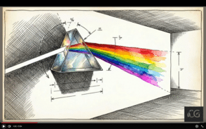 The transition from a standard residential interior to a professionally curated gallery space begins with a fundamental understanding of intentionality. General room illumination serves a functional purpose—safety, navigation, and broad comfort. In contrast, accent lighting is a strategic intervention designed to transform a static object into a commanding focal point through precision and drama. In my experience as a conservator, the primary objective is to achieve "believability." This refers to the viewer’s ability to witness the artist’s intended chromatic relationships and spatial depth without the interference of artificial "yellowing" from low-grade bulbs or the "clinical blue" shifts common in standard household LEDs. Standard home lighting frequently betrays the artwork, resulting in flattened textures and dull, dishonest colour rendering. Professional lighting restores the work's "presence," ensuring that pigments appear as the artist intended. To achieve this standard in a private collection, one must move beyond broad brightness and master the disciplined application of technical metrics and geometric placement.
2. Decoding the Technical Spectrum: CRI vs. Kelvin
In any serious collection, technical specifications are the non-negotiable foundations of visual accuracy and emotional tone. To replicate the environment of a high-end gallery, homeowners must balance the Colour Rendering Index (CRI) with Correlated Colour Temperature (Kelvin).
CRI Analysis: The Metric of Truth
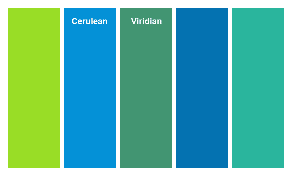
The CRI (rated 0–100) evaluates a light source's ability to render colours accurately compared to natural daylight. For residential art, a minimum of 90+ is required, but I advocate for the 95–97+ range found in world-class institutions. At this level, subtle pigment relationships—such as the delicate shifts between cerulean and viridian—are preserved, giving the viewer total confidence in the work’s appearance.

Short Focus On CRI
Kelvin Interpretation: The Emotional Baseline
While CRI manages accuracy, Kelvin (K) dictates the perceived warmth or coolness of the light.
- Warm Amber (2700K–3000K): These values produce an inviting, intimate light. 3000K is the industry standard because it is warm enough to feel human yet neutral enough to respect the work’s integrity.
- Cool Daylight (4000K–5000K+): These higher values are often used for clinical precision but can flatten the emotional resonance of traditional works.
From our perspective, 3000K is the "sweet spot" that builds buyer confidence. It suggests the work is being presented honestly, which naturally increases "dwell time"—the duration a viewer engages with a piece—a metric directly linked to the perceived value of a collection. This technical foundation, however, is useless without proper geometric execution.
3. The Geometry of Perfection: Eliminating Glare and Reflections
The physics of light is governed by the Law of Reflection: light leaves a surface at the same angle it arrives. Without geometric precision, glossy varnishes and glass-framed pieces act as mirrors, reflecting the light source directly into the viewer's eyes and creating distracting visual noise.
The 30-Degree Rule and the 1/3 Calculation
To minimise glare on artwork, it is best to utilize the "30-Degree Rule." Achieving this requires a simple mathematical rationale: mount your ceiling track or recessed heads at a distance from the wall roughly equal to one-third of your ceiling height.
Practical Example: If you have a 10-foot ceiling, your lighting fixtures should be mounted approximately 3.3 feet away from the wall. This geometry ensures that the angle of incidence directs reflections downward toward the floor rather than toward a viewer standing at eye level.
Glare Mitigation Strategies
- Museum-Grade Glass: Utilize high-quality anti-reflective glazing to minimize surface interference.
- Adjustable Fixtures: Use luminaires with fine-tuned aiming to manage "hotspots" on the canvas.
- Beam Spread Control: Match the beam angle to the artwork’s dimensions so the piece, rather than the surrounding wall, remains the focus.
By mastering these angles, we can then tailor the light spectrum to the specific physical properties of different artistic mediums.
4. Tailoring the Spectrum: Kelvin Selection by Medium
Curatorial intent requires that light temperature respects the historical context and material properties of the artwork to evoke the correct emotional response.
- Oil Paintings: A 3000K baseline is recommended to reveal rich pigment relationships and heavy impasto textures without flattening depth.
- Photography and Prints: These mediums often benefit from a neutral 4000K–5000K range to maintain surface precision and prevent the "yellowing" of whites.
- Abstract and Modern Art: For a clean, contemporary aesthetic, 3500K–4000K provides a bright, modern clarity.
- Sculptures and 3D Works: Selection depends heavily on material. Metallic or glass surfaces often require higher illuminance levels to highlight reflective properties, whereas matte works require "shadow-play." Beyond a narrow beam angle (<10°), consider "illumination from below" or side-lighting to "reinvent" the object, creating new structures through a game of light and shadow.
While aesthetic beauty is paramount, as a conservator, I must insist that these choices never compromise the physical integrity of the work.
5. Preservation Standards: Combatting Heat and UV Damage
Light damage is cumulative and irreversible; conservation is the primary responsibility of the serious collector. Fading, embrittlement, and colour shifts are not caused by a single event, but by the total "lux-hour" dose—the intensity of light multiplied by the duration of exposure.
LED: The Conservation Default
LED technology is the mandatory standard for preservation. Unlike incandescent or halogen bulbs, LEDs emit virtually no infrared (IR) radiation (which causes heat-related cracking) or ultraviolet (UV) radiation (the primary cause of fading).
Preservation Benchmarks
Strategic use of dimming controls is vital to managing the cumulative dose. Homeowners must be aware of comparative sensitivities:
- High Sensitivity: Textiles and works on paper are extremely vulnerable and require strictly lower lux levels and shorter exposure times.
- Moderate Sensitivity: Oil and acrylic paintings are more durable but still subject to cumulative degradation.
Dimmers and occupancy sensors allow you to balance visibility with the imperative of preservation, ensuring the light is only active when the work is being appreciated.
6. Practical Implementation: Sourcing and Setup for the Home
The transition from theory to practice is now accessible through specialized hardware. A professional-grade display is within reach of any collector willing to perform a thoughtful audit.
The Hardware Audit
Examine your current environment for reflections and hotspots. The most critical step is replacing standard household bulbs with specialized, high-CRI LEDs (95–98+). Crucially, you must ensure consistent Kelvin temperatures across a single wall. Mixing temperatures (e.g., a 2700K bulb next to a 3000K bulb) creates a "visual mess" that distracts from the art.
Primary Fixture Categories
- Track Kits: Offer maximum flexibility for rotating collections, allowing you to move "spots" as needed.
- Picture Lights: Ideal for intimate, localized illumination, providing a traditional gallery feel.
- Recessed Wall-Washers: Provide a clean, architectural look that keeps the ceiling plane uncluttered while delivering precise, directional beams.
By applying these professional standards of geometry, colour accuracy, and conservation, you transform your home into a curated experience where the artwork remains the undisputed and perfectly preserved focal point.